- Custom dashboards that you build. Select Add dashboard in the app’s sidebar to create one, then Add chart to add charts to it. Any metric your app reports can go on a chart, including custom metrics, and the Metric field suggests the names your app currently reports.
- Intelligence dashboards that AppSignal creates the first time it recognizes metrics from a supported integration, such as Sidekiq, NGINX, Kubernetes, or an AWS service. They are labeled Intelligence in the Dashboards section, and AppSignal keeps their charts up to date unless you customize them.
Charts types
Some data is better understood if the chart is rendered in a different way. We provide the following display options:- Number chart
- Line graph
- Area graph
- Relative area graph
Number chart
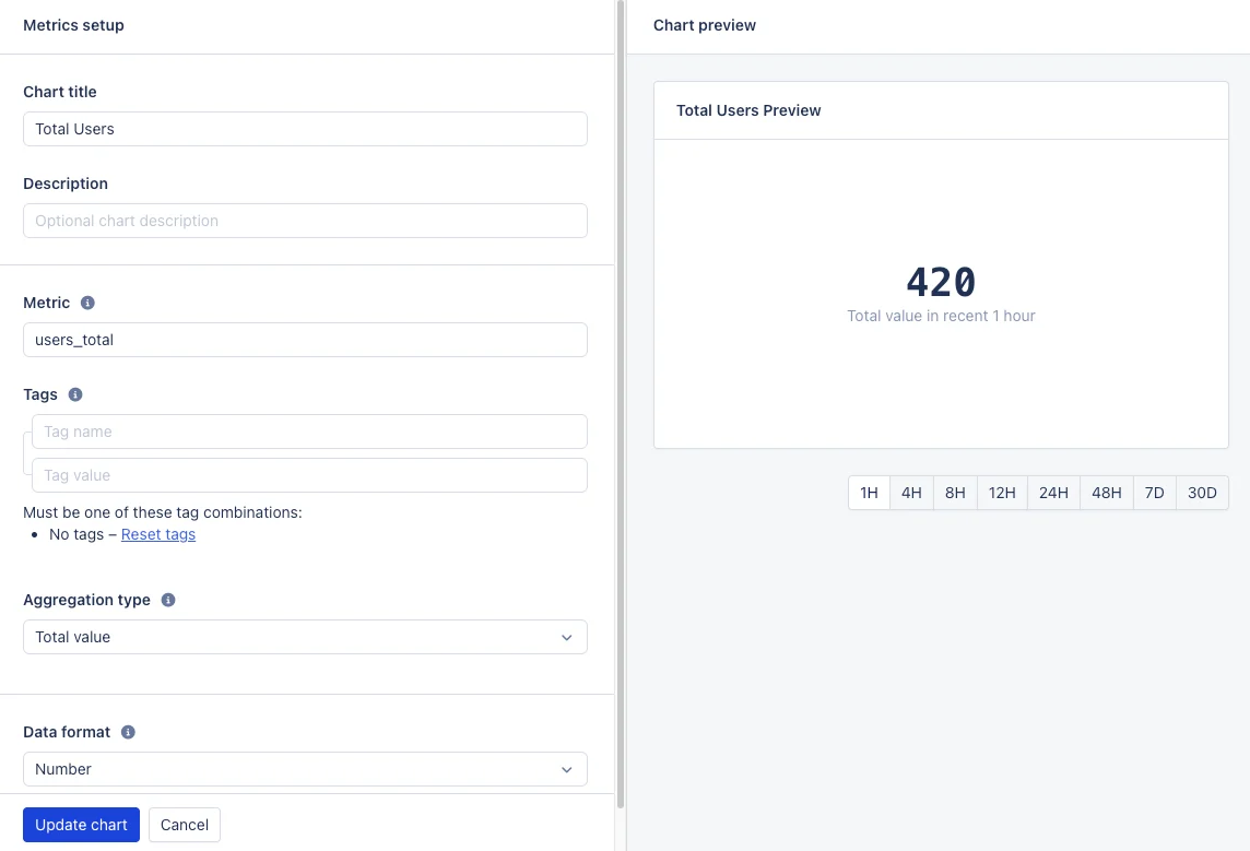
The number chart, also called a Big Number, shows the value of a metric as a large number. This is useful for metrics that represent a single value, such as error count or request count.
- Metric — The metric name to be shown in this chart. Use the full metric name to select one metric, or a wildcard (
*) to select several at once:db_users_document_count,db_*_size. See metric naming for the full rules. - Aggregation type — How the value on the chart is selected or calculated from the metric data in the selected time frame:
Maximum value— the highest metric valueMinimum value— the lowest metric valueAverage value— the average of the metric valuesTotal value— the combined value of the metric valuesFirst value— the first metric valueLast value— the last metric value
- Data format — The value format used to display values in the chart and chart legends. See value formatting for the available formats.
- Tags (optional) — Which tags of the metric to display in the chart. When empty, every variation of a tag gets its own entry. Enter tags to filter for certain tag values; in that case, all tags of the metric need to be specified, either with a value or a wildcard. See metric tags for the full reference.
create_dashboard_visual in the MCP tool reference.
Line, area, and relative area graphs
When selecting the “Line graph”, the default graph type is “Line graph”. Use “Area graph” to render areas beneath the lines and “Relative area graph” to render a graph with the relative values of each data point. This renders a percentage for each data point from 0–100 and fills out the graph accordingly. This can be used to easily show the relation between data points in a graph. The image below shows the same metric in all three graph types. In the Line and Area graph you can see that the amount of data has increased, but the Relative area graph at the bottom shows that the relation between transmitted/received has not changed over time.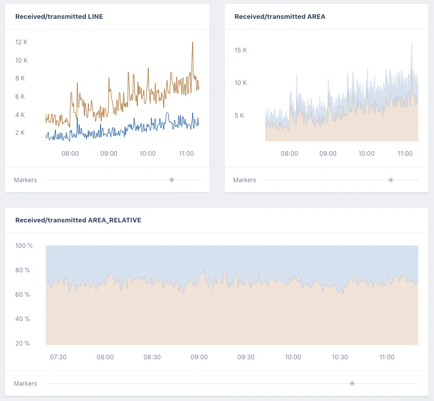
NULL values
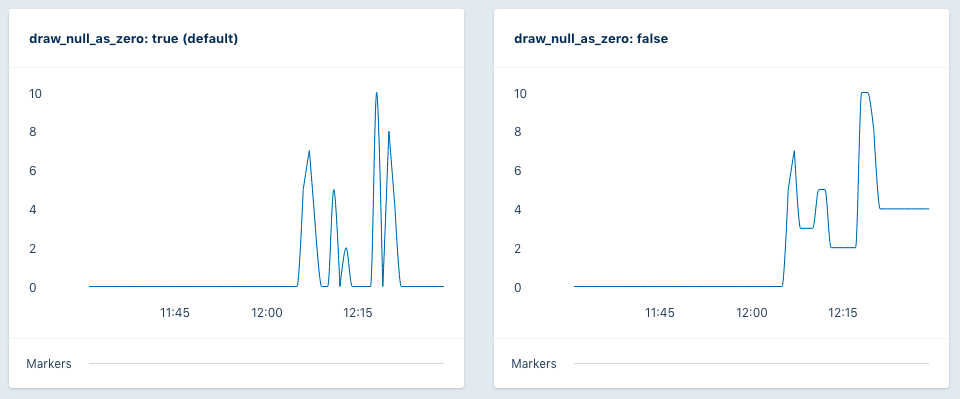
Not always does every point in time have a value for a metric, yet the value is not0. In our system we do not record a value for this time and treat this point as NULL rather than 0. This means no value is present and can be interpreted in two ways. Either it was actually 0 or it retains the value of the last known data point in the graph.
The “NULL values” option (“Draw NULL as 0” by default) allows for the configuration of the draw behavior for a graph. If set to “Draw NULL as 0” it will treat the NULL value as 0. If set to “Repeat last known value” it will repeat the last known value until a later point in time specifies a new value.
See the difference in the graph below. With “Draw NULL as 0” the graph makes a sharp drop to 0 every time the app stopped reporting data. With “Repeat last known value” the graph looks less volatile in terms of lines moving up and down.